01
Spotlight
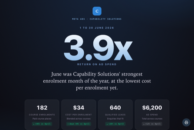
Best for · a single standout resultOne standout result owns the screen, with a few supporting cards and a short signoff beneath it. Reach for it when a single number tells the story and you want it impossible to miss.
Report styles
The same numbers, 17 different looks. You pick the layout that fits the client and the story. Here is what each one actually means, and when to reach for it. Every layout adopts your client's brand colour.
One standout result owns the screen, with a few supporting cards and a short signoff beneath it. Reach for it when a single number tells the story and you want it impossible to miss.
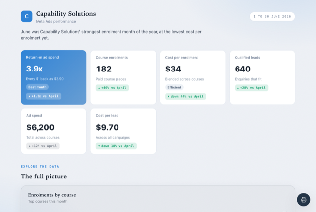
A tidy working grid of the metrics with one trend chart and the breakdowns beneath it. For data minded clients who want to read the numbers at a glance, no written story attached.
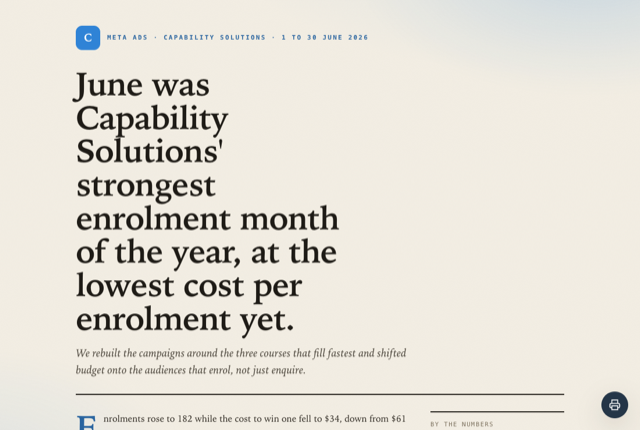
A written wrap up that reads like a magazine feature, with the numbers kept to a quiet rail beside the prose. For a milestone or campaign you want the client to sit down and actually read.
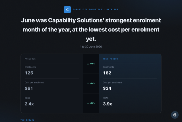
Sets this period beside the last, metric by metric, and calls out the single biggest genuine win. The right choice when the story is improvement and you want the change made obvious.
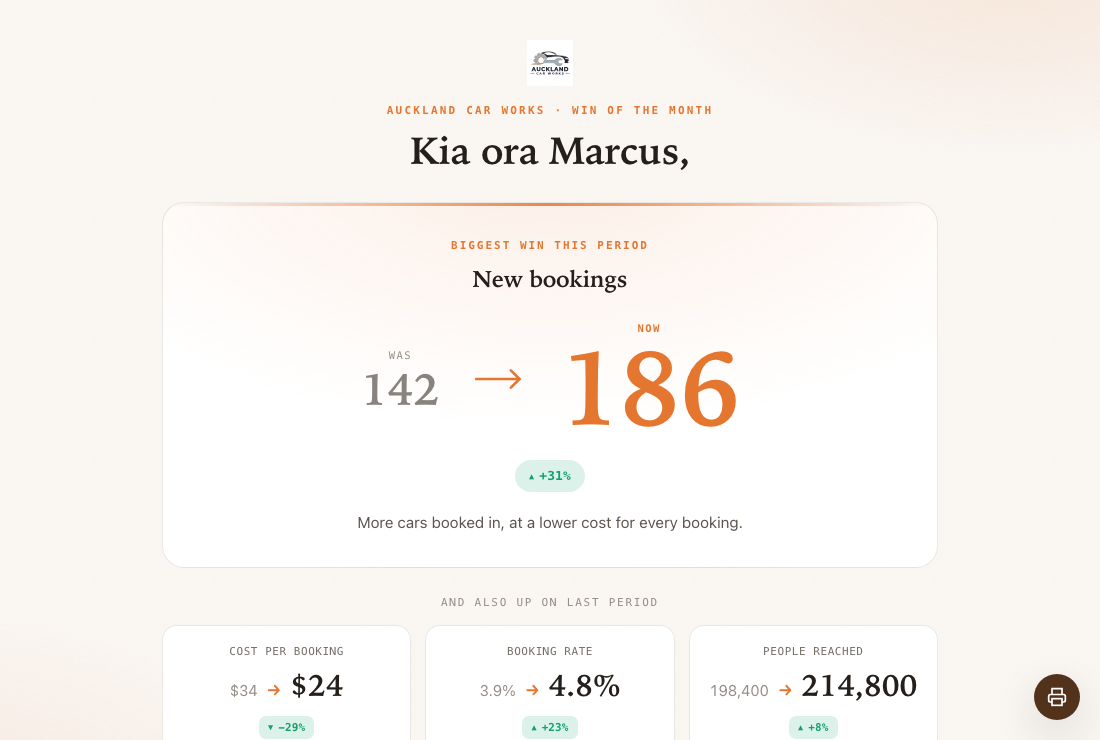
Picks your single biggest genuine improvement and shows it as one number rising from its old value to its new. Best when you want to celebrate one clear movement, not a wall of figures.
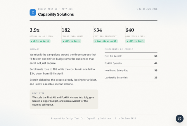
Everything a busy owner needs on one calm screen: a short summary, four headline cards and a warm closing note. Made for the quick check in, read in the time it takes to open the email.
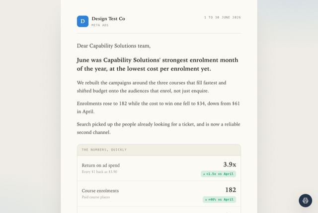
The report as a warm personal note, with the key numbers woven straight into the sentences. Best for building the relationship, when a friendly update matters more than a dashboard.
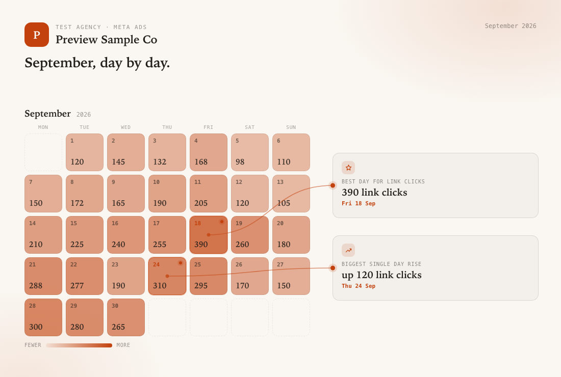
A full month calendar with every day heat shaded and the standout days called out. Use it to show the shape of the month, which days carried it and which were quiet.
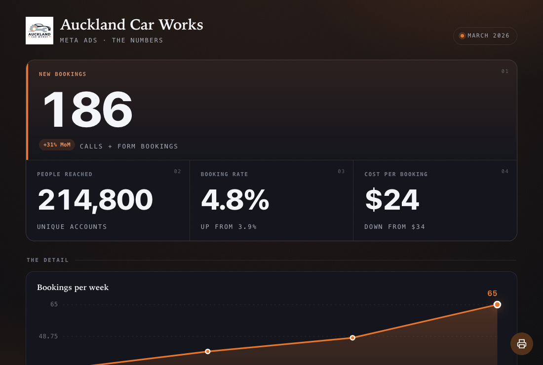
A bare, confident wall of the figures with no summary, narrative or charts at all. For the client who only ever wants the numbers and nothing around them.
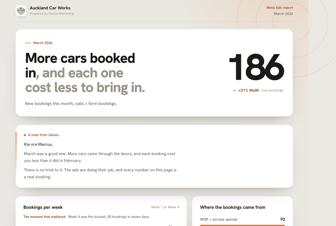
A refined, magazine grade performance document. One oversized result opens it, a single clean chart is annotated to point at the moment that mattered, a calm row of the key numbers reads beneath, and a short note in your own voice signs it off. For the client relationship you most want to impress.
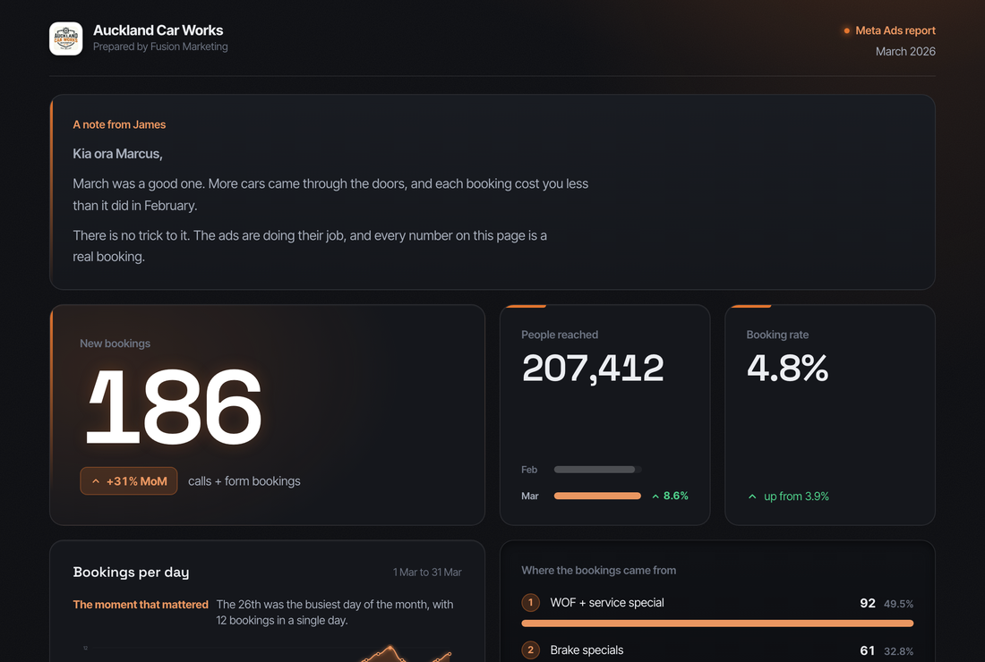
A cutting edge dark dashboard, read like a product screen: one glowing hero result, two live stat tiles, a luminous trend chart and a ranked breakdown, all in an aligned bento grid. Opens and signs off in your own voice. For the client who wants it to feel modern and premium.
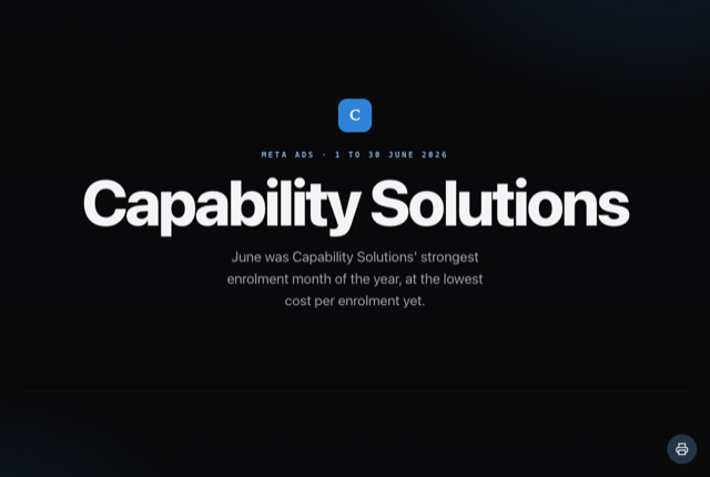
Plays as a sequence of full screen scenes, one big idea at a time. Reach for it for a launch worthy reveal or a pitch, where the presentation matters as much as the numbers.
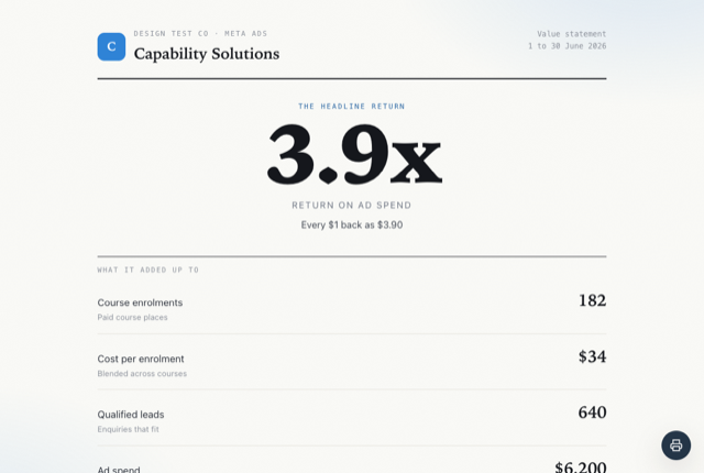
Frames the period as value delivered: what went in, what came out, and the return as the hero line. Made for proving return on investment to the person who signs off the spend.
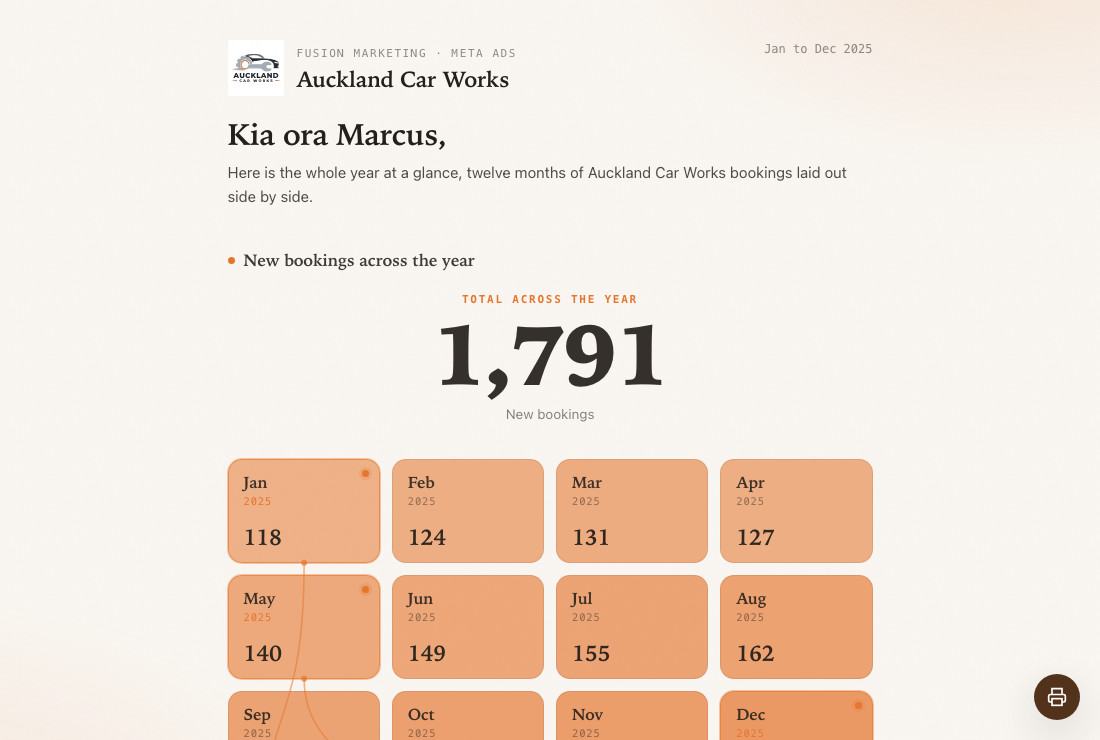
Two full year grids, one cell per month, with the standout months and the year's best creatives surfaced. Made for a year end wrap up or an annual review meeting.
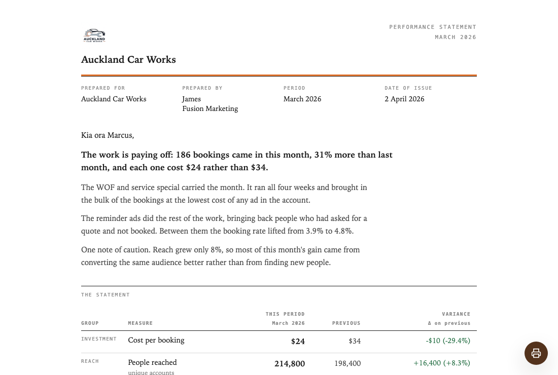
Three to four pages of business document: an addressed opening that states the conclusion, one full width statement of every figure with its variance, two or three plain exhibits, what moved and why, and a signature. For a client who files the report, forwards it, or tables it at a board meeting.
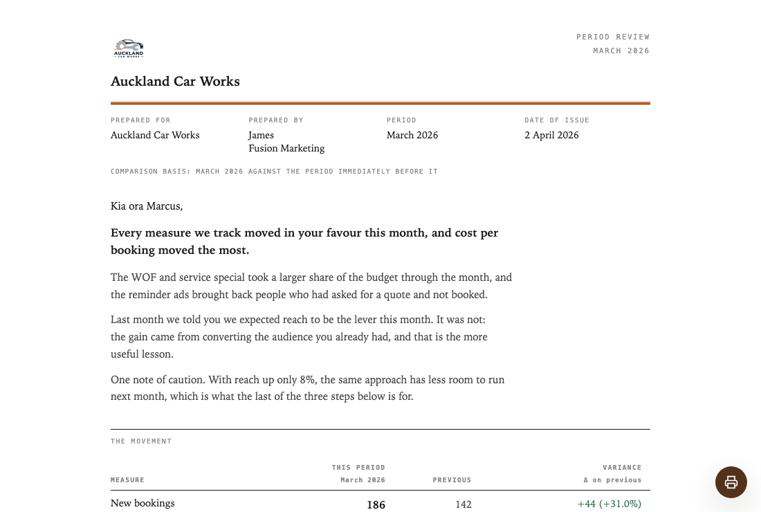
Two to three pages built around the variance: a verdict, then the reasoning, then every metric with its movement stated absolutely and relatively, what is ahead, what is behind, and what we are changing versus deliberately holding. For the client who wants to see the movement, not the story.
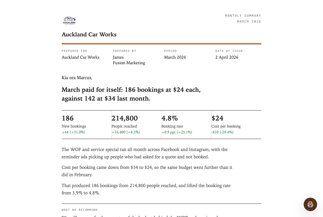
A single formal page: the answer in one addressed sentence, a strip of figures with their movement, three short paragraphs on what happened, what it cost and what it produced, a warm close, and a signature. For the client who reads it on their phone between meetings and still wants a document, not a dashboard.
Not sure which to pick? Start with the one that fits this month's story. You can switch any report to another layout in a click, and it matches the client instantly.
A layout is the structure. A style is the skin: the background, the mood and the finish. The Flagship layout ships in three styles, so you can match the client. Every other layout has its own set look.
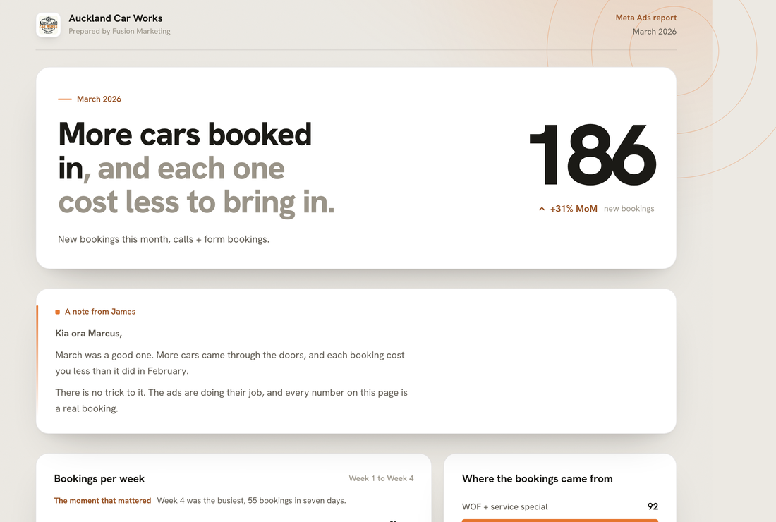
A light report: white background, black text, plenty of room. The clear, professional default that suits any client.
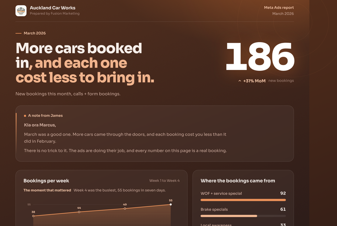
A dark report on deep warm charcoal, with your brand colour glowing against it. Rich and dramatic, for a premium feel.
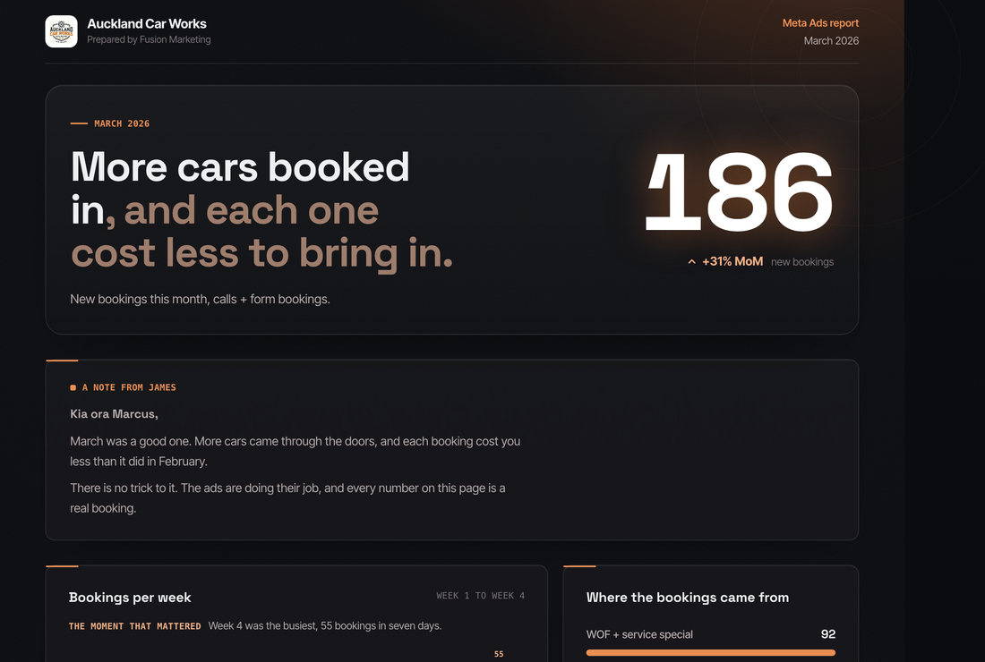
A dark report on cool near black, with tight lines and a technical edge, its charts read like instruments. Built for tech and SaaS clients.
Connect your data, choose a look, and Clientdeck AI writes the whole thing, on your client's brand.